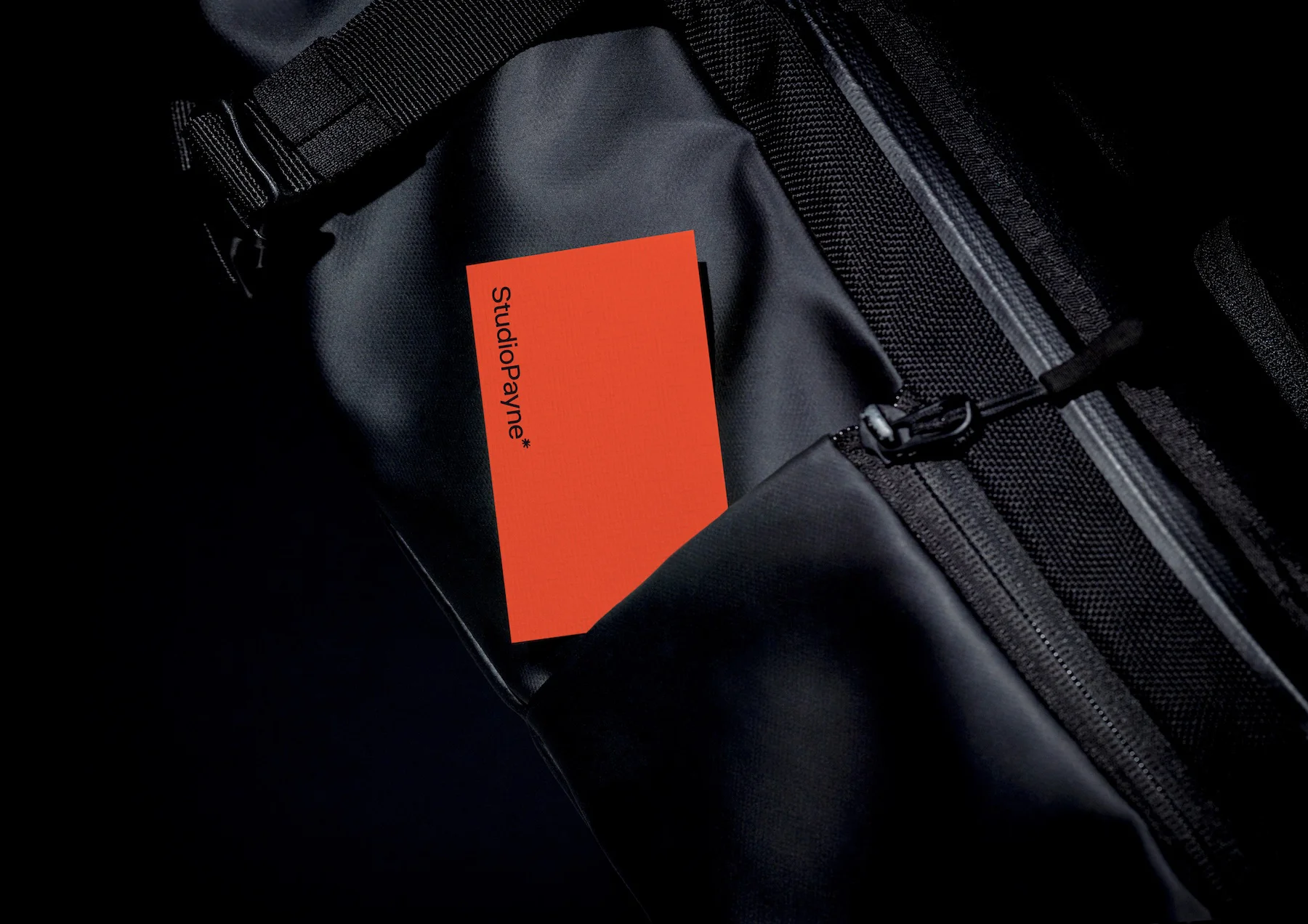
Last updated on 16th March 2026
I spend my time helping other businesses build strong brands… while mine had quietly drifted into ‘that’ll do’ territory.
I had a clean, simple visual identity that worked okay. It focused on the work but lacked personality or a unique voice. It was done a few years ago when Studio Payne wasn’t my main focus, more of a side gig. Now it’s my full focus, it was time to give it the attention it deserves.
The main issue wasn’t that things looked bad, it was that nothing was defined. The brand lived in my head, which meant inconsistency crept in. Social graphics would have rounded corners one week, sharp edges the next. Proposals were minimalist on purpose, but text-heavy and a bit underbaked compared to the work I was presenting in them. Time to take my own advice.
What wasn’t working before
Everything was developed on the fly. When it came to creating service-focused social posts, I’d start from scratch each time or work from rough templates that never quite felt right. Small details would drift, a radius here, a weight there.
More frustratingly, I had no rules to fall back on. No system. Just instinct, which works until it doesn’t.
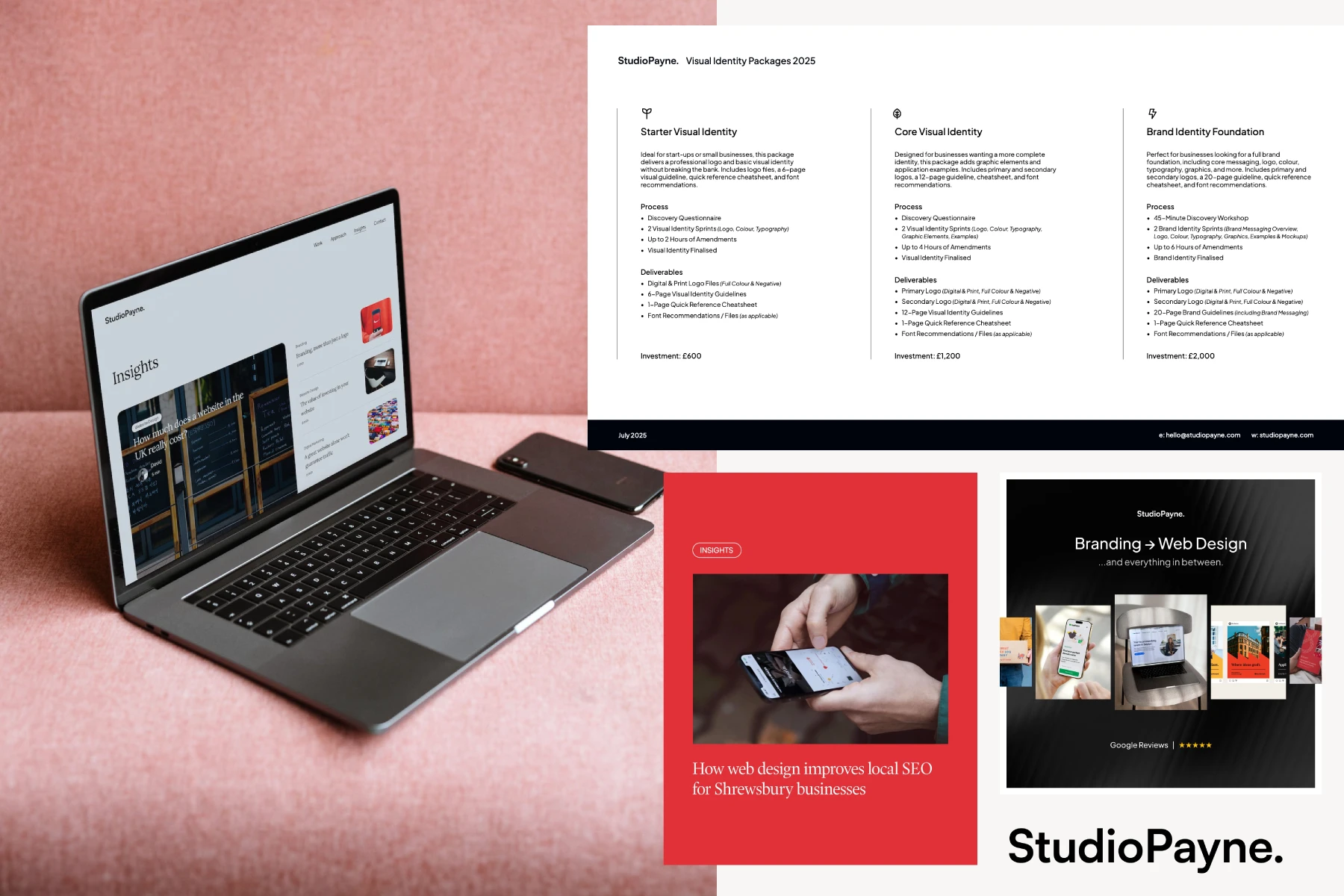
How I approached the brand refresh
Designing for yourself is genuinely harder than designing for clients. You second-guess everything, chase perfection, revise endlessly.
I tried to treat myself like a client. I set clear times, objectives, and rules for the process. There was a bit of scope creep, of course, but having that structure helped keep it moving forward instead of spiralling into endless tweaks.
What changed in the Studio Payne brand
Visual identity
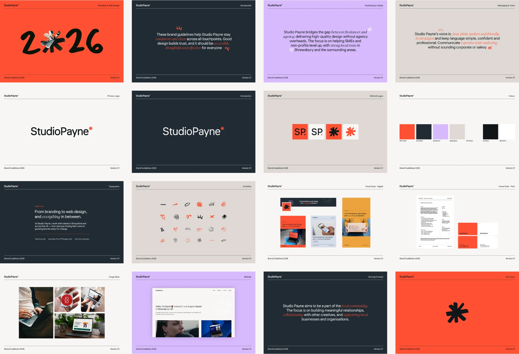
I wanted to keep the clean look with a focus on the work but inject some personality and create a system I could actually use.
The logo got a tweak with a new logotype and the introduction of an asterisk – a distinct graphic mark that breaks up the text and gives the identity a recognisable anchor point. I added a bold, burnt orange as an accent colour. Originally, Studio Payne was black and white with no accent at all. When I looked at local agencies, they leaned into darks and navies or lighter palettes with pastel accents. The deep, striking orange isn’t close to anything around here, which was exactly the point.
Typography was updated, and I introduced a secondary typeface for variety and contrast. To support the creative side and inject more personality, I added hand-drawn elements like scribbles, arrows, and underlines – a nod to how every project starts as ideas in a sketchbook. These show up across the website in negative space, pointing towards key info or highlighting things that matter. They extend the brand across marketing material and give the whole identity a bit more life.
Defining messaging and tone of voice
I knew my voice, but it wasn’t defined. Even a few simple sentences make a difference:
“Studio Payne’s voice is clear, plain-spoken and friendly. Avoid jargon and keep language simple, confident and professional. Communicate expertise with authority, without sounding corporate or salesy.”
This matters because our industry loves jargon and cliches, but a lot of small business clients have never heard half the terms we throw around. They don’t know what SEO stands for or that they need web hosting. They need educating, but in language they actually understand. I’ve always been good at this, but defining it on paper helps keep it consistent as the business grows.
Website reskin and updates
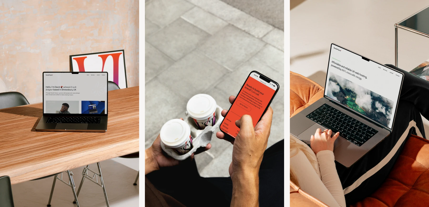
The website didn’t need a full rebuild, just a reskin with refinements and updates. The structure stayed largely the same, but I tweaked typography, adjusted colours, and added elements like the hand-drawn scribbles. I updated animations to feel more polished and considered. I also added a few new areas, like a page on web hosting.
The changes weren’t drastic, but together they make everything feel more intentional and consistent with the new brand.
Designing for yourself is harder than you think
When you’re the client and the designer, it’s easy to overthink every tiny detail. I tried to keep perspective and focus on what really matters. Treating myself like a client (deadlines, clear objectives, defined scope) helped me stay objective and actually finish the thing.
What I learned from the process
I already tell clients that a brand identity guide is worth its weight in gold. Whether it’s a simple one-page cheat sheet with colours and typography or a full set of guidelines, it keeps everything consistent.
Even already, having a guide has already made things easier. I’ve set out designs for social graphics that work across multiple platforms and formats. Now I just need to swap in text, images, and colour variations. They’re consistent with other types of social posts, and I’m not rebuilding from scratch or second-guessing decisions every time.
Investing in your brand pays off, even when you’re the one doing the work.
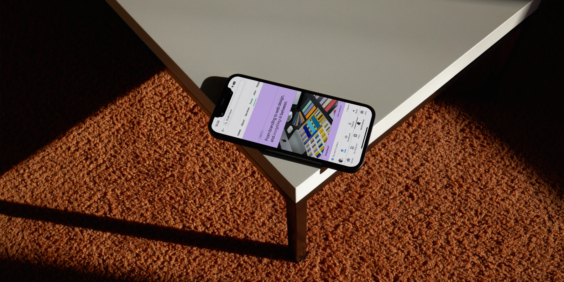
How the refreshed brand supports the work I want to do
The refresh helped define my voice, my message, and the type of work I want to focus on. The original Studio Payne brand was designed as a side project. Now it’s my main focus, and as a brand designer, it should reflect what I do and the level I operate at.
It’s not just about looking the part. It’s about having a foundation that supports better work, clearer communication, and more confidence in what I put out into the world.
Lessons other business owners can take from this
Your brand is more than a logo. A system or set of guidelines helps you look professional and stay consistent without reinventing the wheel every time you need to create something.
Consistency beats constant redesign. If your work has evolved, your brand should too. Don’t wait until things feel broken – invest in yourself before they do. Whether it’s your brand, website, shop, or physical space, define how you want to be seen by the world.
Looking ahead: the next chapter for Studio Payne
With a defined brand, I can now focus on what matters: creating work I’m proud of and helping other businesses do the same. This is the foundation for the next chapter of Studio Payne, and I’m excited to see where it takes me.